OUR WORK FCDO
Foreign Commonwealth & Development Office safeguard the UK's security, defend our values, reduce poverty and tackle global challenges with international partners.
Web Farm Media helped FCDO deliver the redesign, UX and front end development for their Development Tracker website.

ABOUT PROJECT
Web Farm Media helped FCDO deliver the user experience and interaction design for their Development Tracker website. We also worked on the front end development of the website.
PROJECT INTRODUCTION
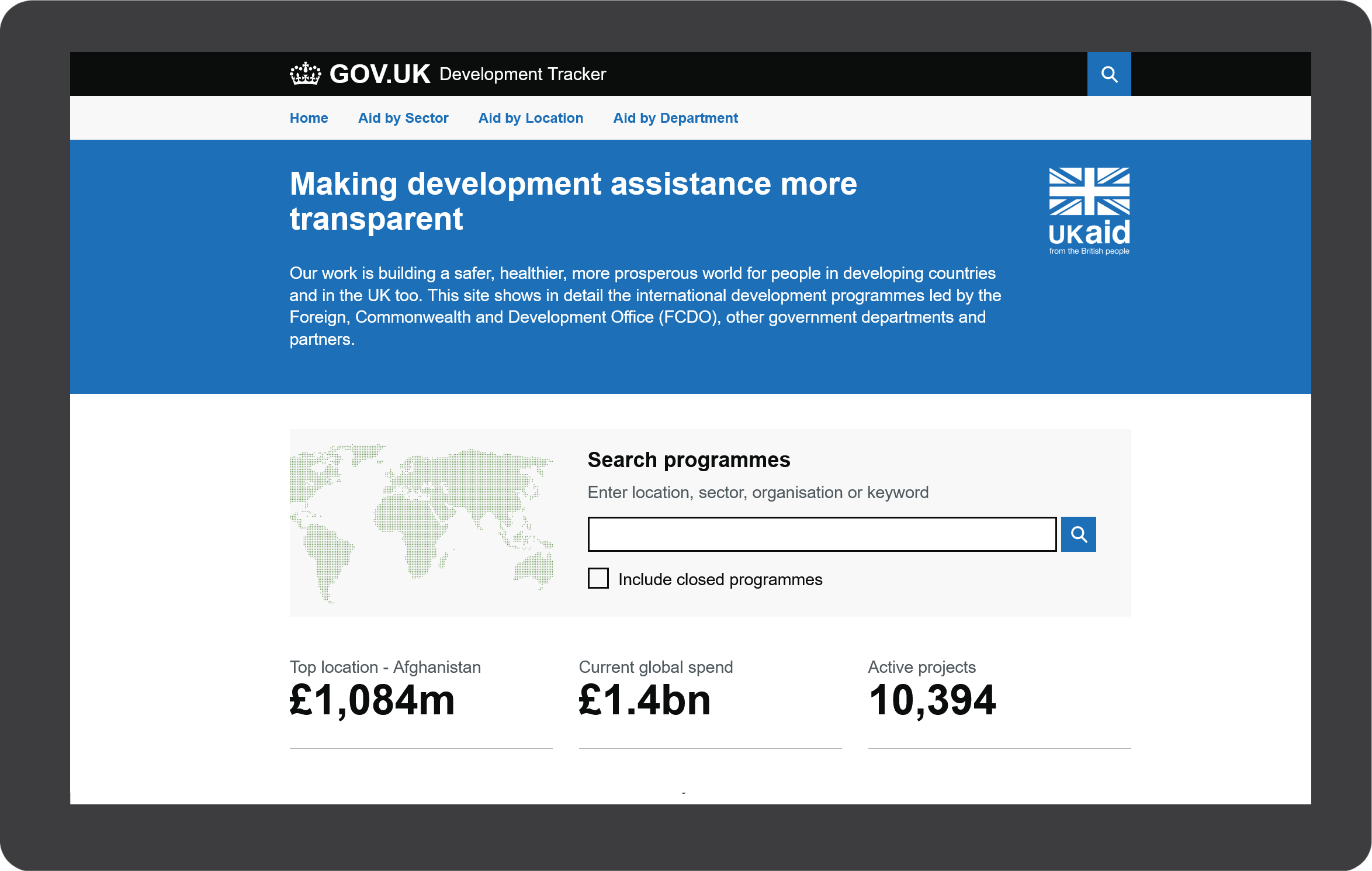
Development Tracker allows you to find and explore detailed information on international development and humanitarian Programmes funded by the UK Government. The tracker is built using open data published by UK Government and partners, using the International Aid Transparency Initiative (IATI) standard.
THE PROBLEM
The Development Tracker website was originally created to monitor and report on various development projects, including infrastructure, education, healthcare, and more. Over time, the website had become outdated, difficult to navigate, and did not adhere to modern design and accessibility standards.
The Foreign Commonwealth & Development Office recognised the need for a redesign to improve user experience, increase accessibility, and align with GDS design principles.
OUR OBJECTIVES
- Align with GDS Design Principles
- Improve User Experience
- Enhance Data Visualisation
- Ensure Accessibility
- Delivery Front End Development
We redesigned the website in accordance with the GDS design principles to achieve a consistent, user-centric, and government-branded look and feel. Our top priority was to enhance the user experience to make it more intuitive for a wide range of stakeholders, including government officials, project managers, and the general public.
Improvements to the visualisation of development project data were key to help users quickly understand the status and impact of projects, whilst ensuring the website is accessible to people with disabilities and complies with the Web Content Accessibility Guidelines (WCAG).
THE PROJECT TEAM
Web Farm Media worked alongside an FCDO team consisting of:
- Product Owners
- UX/UI Designer and Developer (that’s us)
- Back End Developers
- Testers
THE USERS AND AUDIENCES
The users and audiences for the application were as follows:
- General Public
- Government Departments
- Project Managers
PROJECT APPROACH
We worked with FCDO users and product owners to gather requirements for the new application.
INFORMATION ARCHITECTURE
This played a crucial role in the redesign of the Development Tracker website, as it laid the foundation for an improved user experience and navigation. This phase involved organising, structuring, and categorizing content and data on the website to make it more intuitive and user-centric.

WIREFRAMES & PROTOTYPING
Created wireframes to outline the new layout, navigation, and user interface elements, focusing on simplicity and adherence to GDS design principles. In some cases, wireframes were turned into low-fidelity interactive prototypes, allowing stakeholders and users to interact with the basic structure of the website to validate the usability and functionality before investing in full-scale development.
We developed a prototype allowing stakeholders to visualise and interact with a website's interface before the final product is built. The Prototype played a key role in refining the user experience and ensuring that the website's functionality aligned with user needs and GDS design principles.
MOBILE FIRST DESIGN
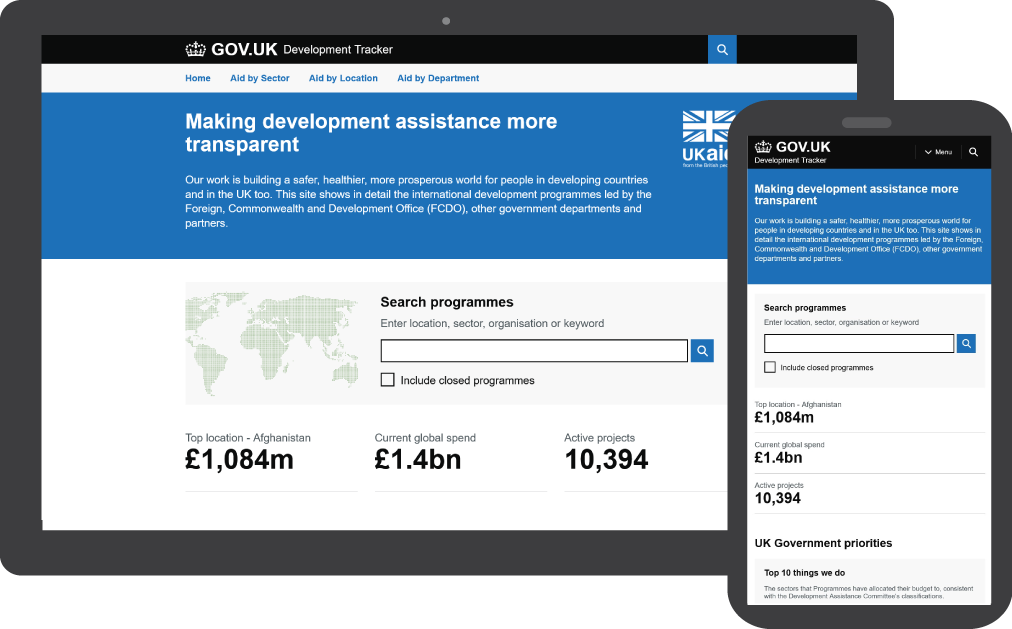
By adopting a mobile-first design approach, the Development Tracker website is optimised for the increasing number of users who primarily access the site on mobile devices. This strategy ensures a more streamlined, efficient, and user-friendly experience, aligning with the GDS design principles and emphasizing the importance of meeting user needs.
ACCESSIBILTY IMPROVEMENTS
Accessibility improvements were essential to ensure that the Development Tracker website could be used by individuals with disabilities, making it inclusive and compliant with accessibility standards, such as the Web Content Accessibility Guidelines (WCAG).
- Accessibility Audit
- Compliance with WCAG
- Contrast and Readability
- Keyboard Navigation
- Semantic HTML
DATA VISUALISATION
Redesigned project pages to improve data visualization through interactive charts and maps.
FRONT END DEVELOPMENT
The front-end development process focused on creating a user-friendly, responsive, and visually appealing interface that aligned with the Government Digital Service (GDS) style guide and best practices.
- Responsive Design
- HTML, CSS, and JavaScript
- Cross-Browser Compatibility
- Data Visualisation Charts
TESTING
Testing was a critical and iterative process in this project. It ensured that the website is free from defects, functions as intended, and meets the requirements and expectations of its users.
It was important to conduct testing at every stage of the design process to ensure a high-quality user experience.
MOCKUPS & WIREFRAMES
Our low and high-fidelity wireframes made sure that our design decisions were communicated to the team building the end product and that target users were accounted for.


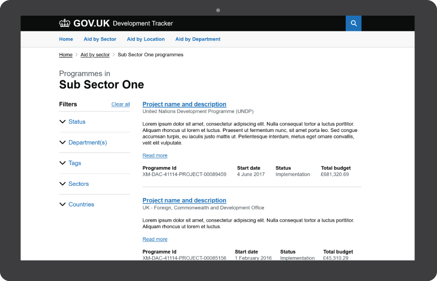
FILTER RESULTS EASILY
The implementation of a filter for projects was a valuable feature that allows users to sort and find specific projects or development information based on various criteria.
Filters made it easier for users to narrow down a large dataset, find relevant projects, and access the information they need efficiently.
- Find Individual Project
- Use Multiple Filters
This helped users find what they were looking for quickly.
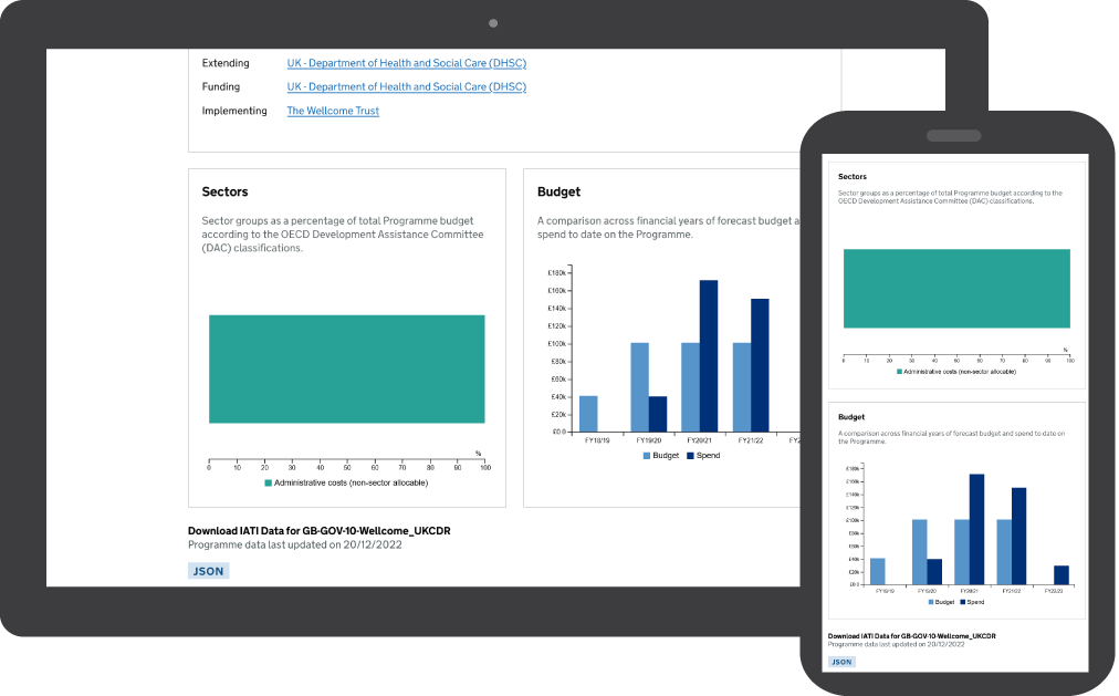
DATA CHARTS
Data charts were an essential feature of Development Tracker.
We aimed to present information and project progress in a visual and digestible manner. Data charts help users quickly grasp trends, patterns, and insights from the complex data sets.

